
Warm welcome to the new version of the blog.
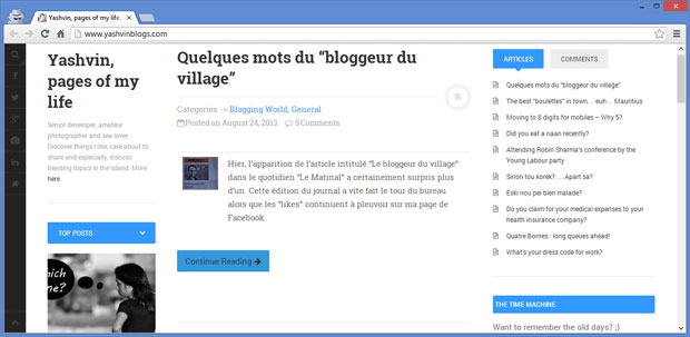
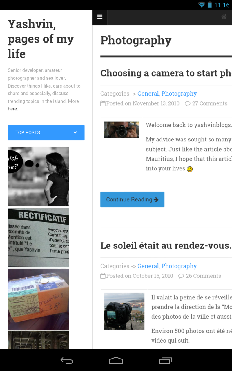
As you noticed at first glance, the look and feel around the blog have changed. For months, I was actively looking for something new to give a fresh look to the blog, which had not been revamped since January 2009! It was very hard for me to find something different from other blogs. And finally, yesterday, I came across the DW Minion theme. Wow. It was exactly what I wanted!
Le coup de coeur ❤
I was so impatient to try the new free theme but first of all, I wanted to change the colors a bit to suit my personal taste. I also need to add a few plugins but I will try to keep them to a minimum this time. Customizing the theme is not completed yet but I decided to put it online so that you can share your views about what can be improved and what you want to see more.
For the next few days, I will definitely look forward to your suggestions and try to see how we can work things together. There are a few things I still need to work out meanwhile.
Thanks for your time on my blog and keep rocking 🙂

Icons on the top bar are a bit too dark (especially on tablet). 🙂
LikeLike
Okay. I will try to change the foreground of those icons. Thanks 🙂
LikeLike
I feel lost. Too cluttered for my taste. The two columns on the left are not needed on every page..
I liked the previous one better which I think you should have just made it responsive, imho.
LikeLike
I loved the previous one too.
I had the option to make it responsive or go on a new one. I think that after 4 years with the previous design, it was high time to give a fresh look too. Thanks for your suggestion. Let’s wait for others to see 🙂
LikeLike
awesome!!! love it 😉
LikeLike
Though the light blue is a soothing colour, the personality of the blog is lost as it now looks like many other websites out there. A minimalist theme would have been better as the focus has been taken away from the blog post (which people come here to read) and replaced with an icon bar/ intro column before the juicy bit.
On a plus side, the site looks good on small devices but I feel you’ve been in a haste to jump on the responsive bandwagon.
LikeLike
yeah lol, a bit hasty yes, I must admit.
But I will definitely take into consideration your feedback as well as others to make it even better, and stand out of the crowd 🙂
I’m thinking to change the color of the left sidebar lightly to help people to differentiate focus between the main content and the “extras”. Perhaps it might be a good thing.
Thanks 🙂
LikeLike
I like the new layout and and as carrotmadman6 said…the icons are barely visible..otherwise, all’s good in the hood..;)
LikeLike
I’ll definitely review the icons 🙂
Thanks.
LikeLike
Beurk!
No, just kidding – of course its much better!!
What did you do to get that crisp, sharp feel for fonts and everything else: it’s much more readable
as if on a Mac screen?LikeLike
To tell you the truth, the font is the default one for the theme. Credit goes to the designer.
LikeLike
Lol, I was preparing to relaunch my blog under Minion 😀
LikeLike
Lol, I’m glad that I was quicker 🙂
LikeLike
I like this design but as per navigation is concerned you have to work on it, it is bit difficult to reach all the pages on your website.
http://www.cheapplanetickets.info/2013/07/mauritius-attractions-places-to-visit.html
LikeLike